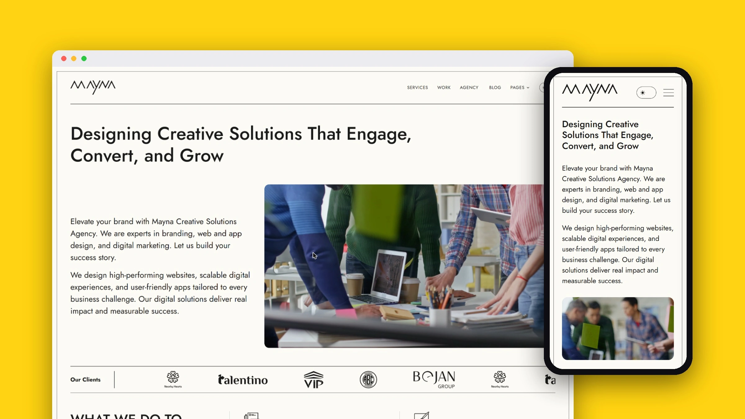
In short
- Goal: give a new studio a credible presence in the Gulf market: a clear offer, real client work and a way to be found.
- What I did: the identity (wordmark, color and pattern), the site structure and copy, the build and the search content.
- Where it is: the current site has been live since early 2025; a full redesign is in progress.
The brand
The wordmark is drawn from sharp, connected peaks, and everything else comes from it: a single strong yellow against black and white, and a pattern of 2:1 diamonds taken from the letters' angles. The rule I set for the system is that there are no circles anywhere; every shape and interaction comes from those angles.
The current site: explain the offer
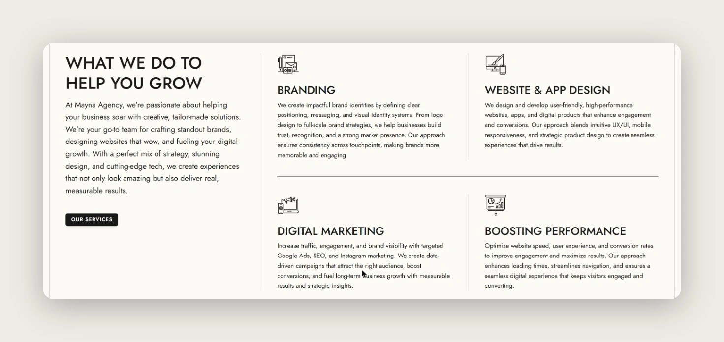
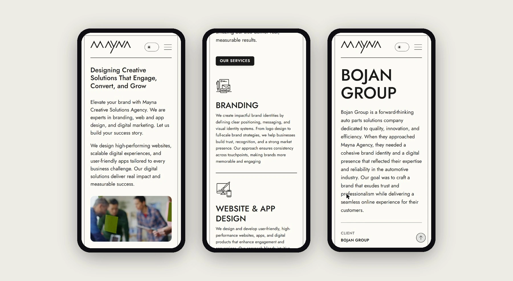
The site you see today went live in early 2025, replacing the studio's earlier site. It has one job: tell a business owner in the region what the studio does, show who it has done it for and make it easy to get in touch. It is organized around four services (branding, website and app design, digital marketing and performance), selected work for clients such as VIP Shop, Nearby Hearts, Bojan Group, ABC Football Academy and Talentino, and a four-step process.
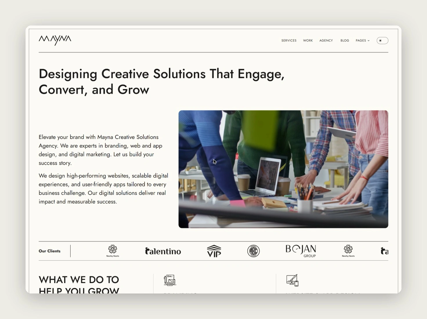
To be found, the site carries a blog written for the searches clients in the region actually make, such as the cost of branding agencies in Dubai. It works in light and dark mode and on phones.
Owning the platform
The site was first built in Framer. I have since rebuilt it as a self-hosted static version with a simple content panel, so publishing a post or adding a project does not depend on a site builder's plan and the studio controls its own hosting and speed. It goes live with the redesign.
Next: show the craft
Looking at the current site honestly, it explains the services well but looks like many agency sites: stock photography and general claims. For a studio that sells brand work, the site itself has to be the strongest example.
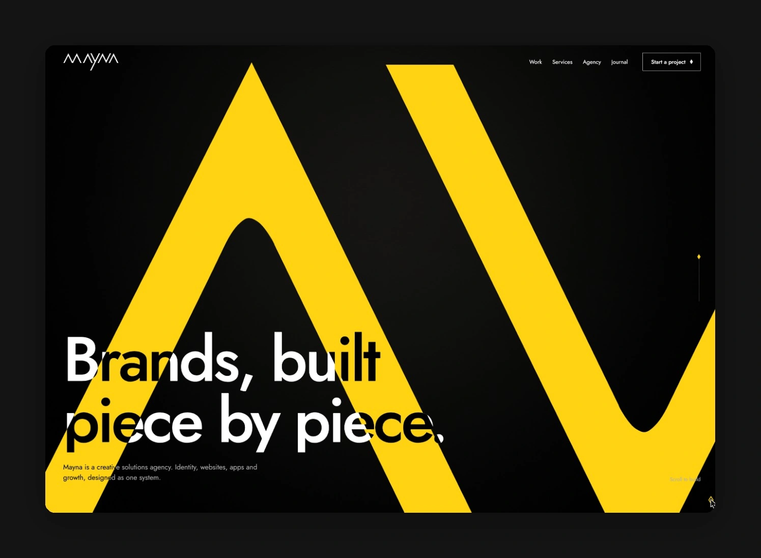
The redesign, Brands, built piece by piece, makes the identity the interface. The page opens close up on the wordmark, the camera travels along its peaks as you scroll, and the letters break into the diamond pattern that carries through the rest of the site. Buttons, links and the cursor all use the same diamond rather than generic effects.
What I would measure
- Enquiries per month from the contact form and WhatsApp, and which page they came from.
- Organic search traffic to the blog, and how much of it reaches a service page.
- For the redesign: whether visitors who see the opening scene go on to view the work, compared with the current site.